Define User Needs
Users need a private, intuitive, and emotionally resonant space to share, save, and consume content recommended by their inner circle. The solution must feel low-effort and familiar, mimicking natural behavior (like texting a movie title), while creating a more organized and persistent alternative. Accessibility for older users, frictionless interaction, and cross-generational usability were also key.
Design Strategy
I framed the opportunity around "Social Curation with Emotional Context." Instead of creating a public network, the goal was to enable micro-sharing within trusted groups. I focused on lightweight actions (like sending a title via emoji or voice), frictionless onboarding, and a layout that adapts to different tech comfort levels. Trust and simplicity were guiding principles—functionality needed to feel native to how users already share content.
Design Solution
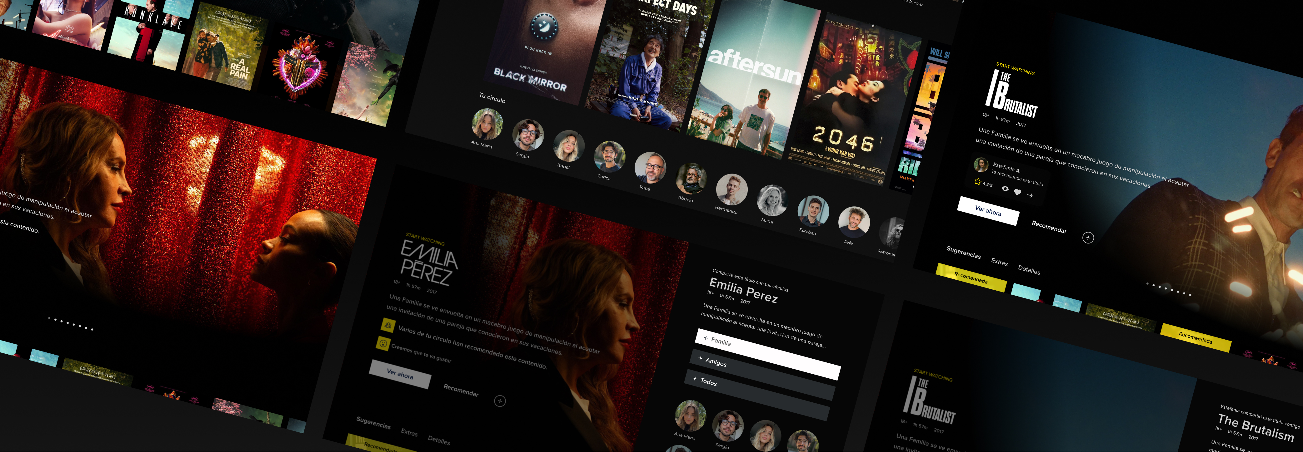
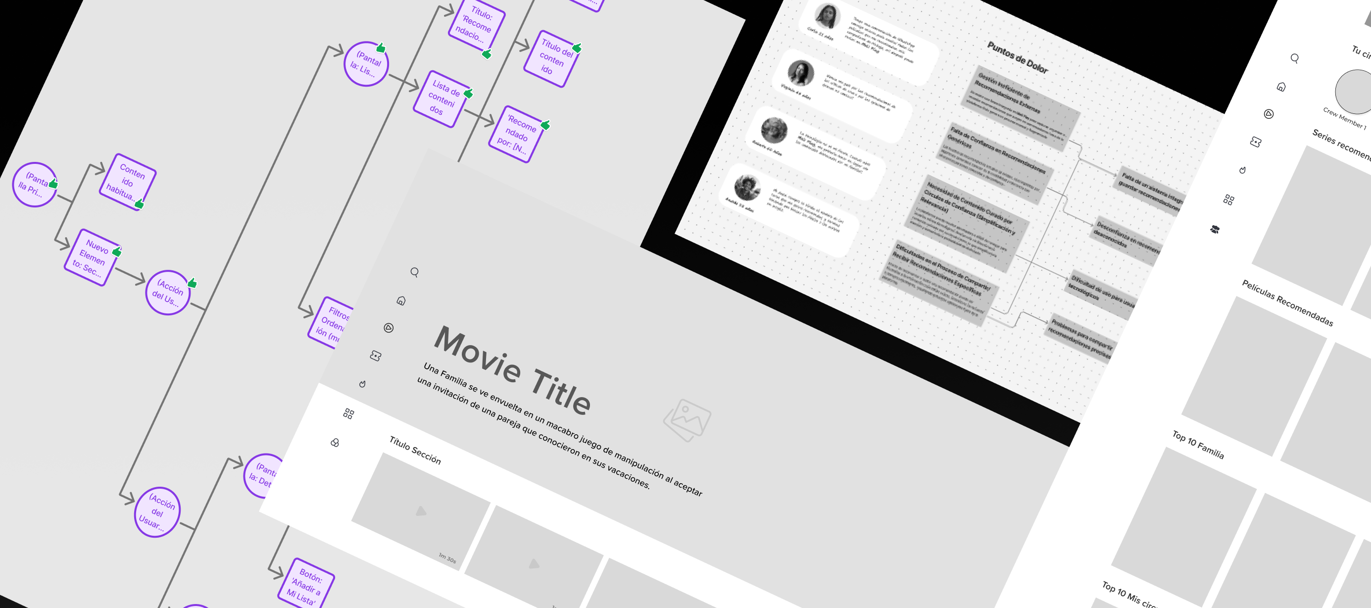
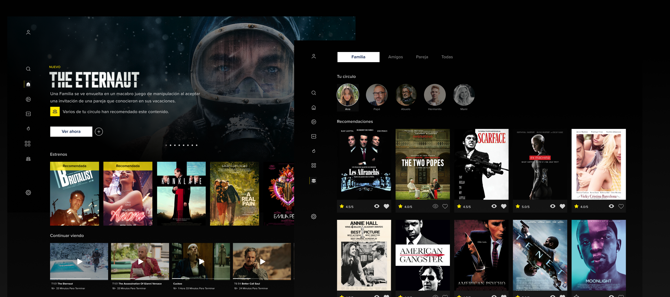
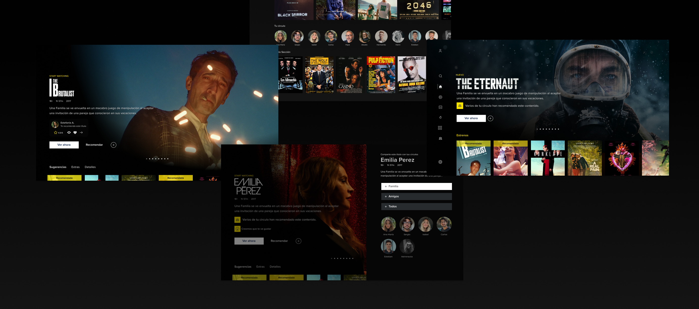
I designed a feature called “Para Vos” ("For You") — a personal recommendation hub within Mercado Play. This space allows users to send and receive content suggestions directly from contacts, attach quick notes or emojis, and organize titles into simple, customizable lists. I created a low-fidelity flow for the core experience (receiving a new recommendation, adding it to your list, starting playback), and three high-fidelity screens that reflect the platform's visual identity. The feature is accessible via the main nav and encourages lightweight, emotionally charged interactions—bringing warmth and humanity into the recommendation process.
Role
As UX/UI Designer, I led the full process from user insight synthesis to final UI delivery. I defined the core experience flow, developed wireframes, designed high-fidelity mockups, and wrote microcopy to maintain tone alignment with the brand’s Latin American, user-friendly voice.
My Contributions
I translated user feedback into actionable opportunities, designed an entirely new feature anchored in real behavior, created flows and visuals that integrate seamlessly with the existing UI, and delivered a solution that addresses both business (retention) and user (connection) goals.
Challenges
The challenge required designing a new experience without disrupting the current product's core architecture. One key difficulty was addressing a diverse range of user tech proficiency—from digital natives to older adults—while maintaining a coherent and elegant solution. Another was ensuring the feature felt private and emotionally safe, rather than like a “social network.”
Achievements
The "Para Vos" feature is intuitive, emotionally driven, and scalable. It bridges the gap between social behavior and product engagement, reinforcing user loyalty while staying true to Mercado Play's accessible brand. The final deliverables reflect user-centric design, visual clarity, and technical feasibility.
Approach
My approach followed a focused, iterative structure: 1) analyze user feedback, 2) define key use cases, 3) map simplified user journeys, 4) create wireframes, and 5) deliver high-fidelity screens. I intentionally balanced craft (visual design quality) with strategy (user insight + business alignment).