Define User Needs:
Independent workers need tools that allow them to request and receive payments easily, track income clearly, and present a professional image. The app must feel intuitive, provide immediate feedback, and reinforce a sense of financial control. There’s also a need to better separate personal and commercial finances, and give more visibility to key features like payment links and transaction history.
Design Strategy:
The strategy focused on redesigning the experience for independent users while staying true to Nequi’s approachable brand personality. I prioritized a task-driven structure, clear entry points, simplified flows, and a tone that balances functionality with emotional resonance. Design improvements centered on information architecture, use of color to guide interaction, and micro-interactions that build trust.
Design Solution:
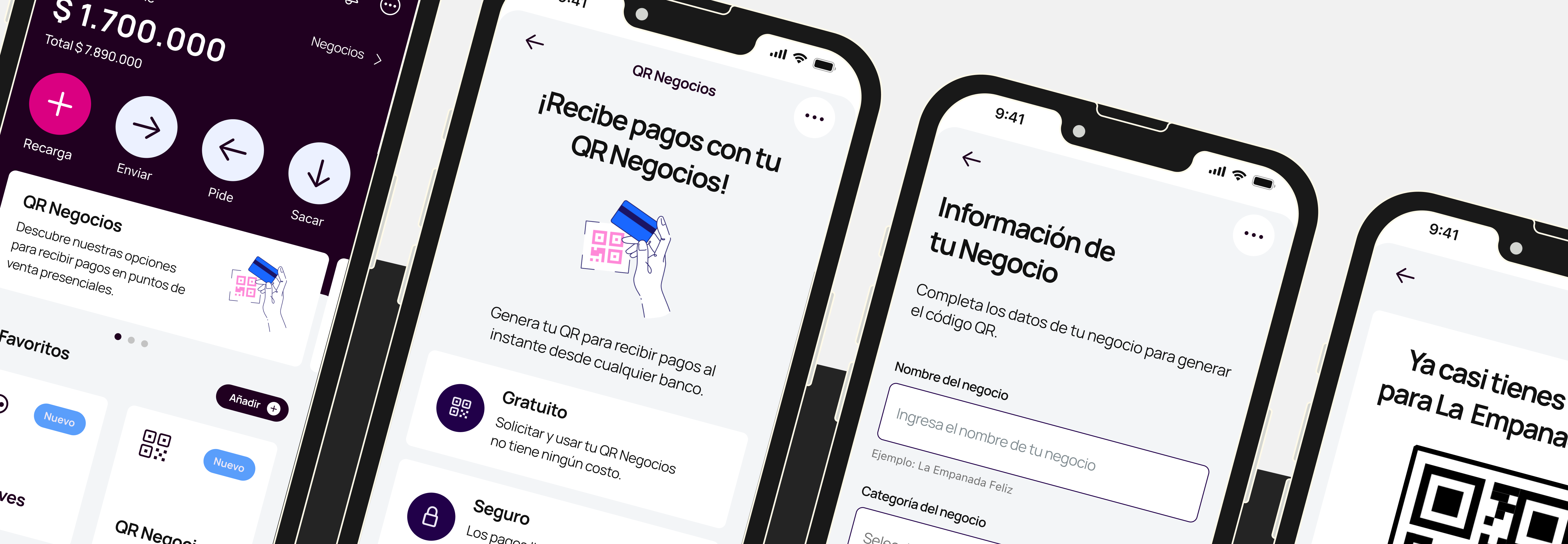
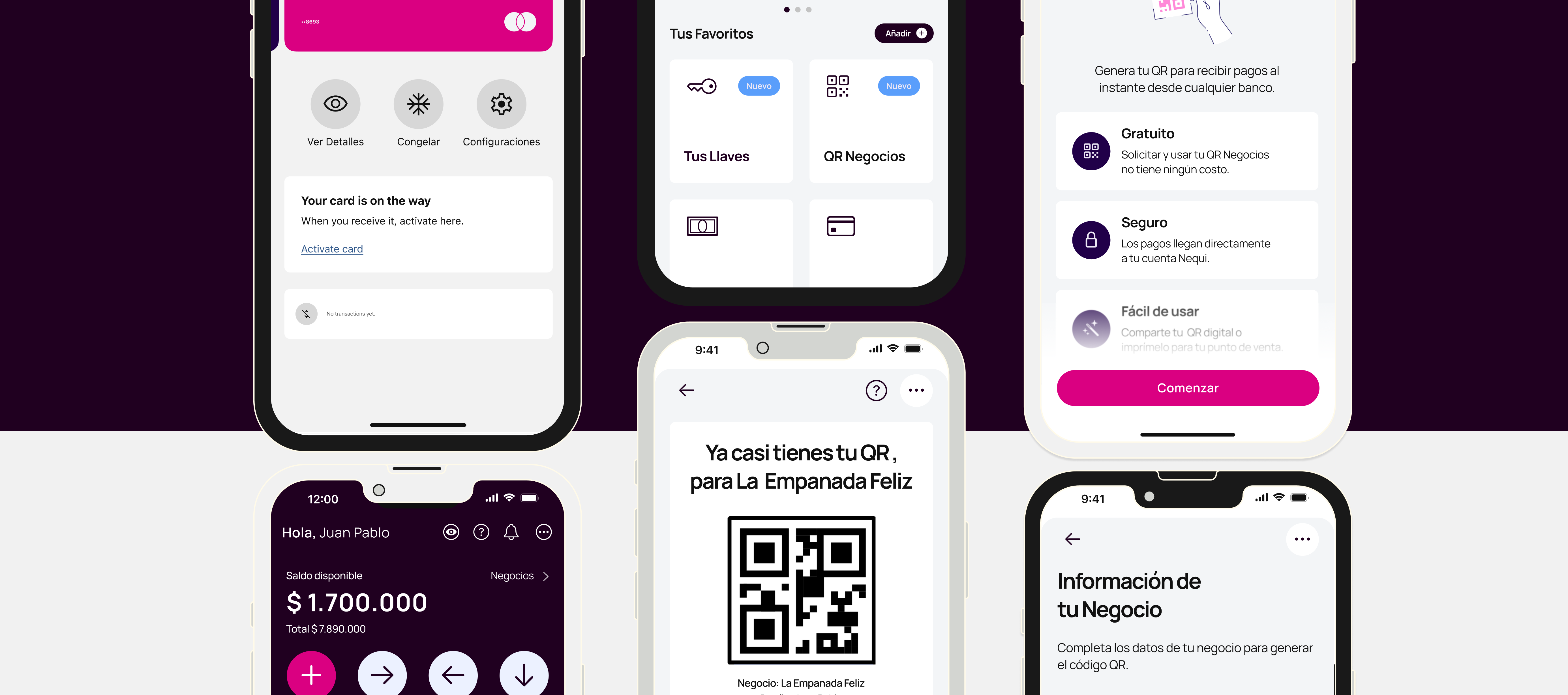
I proposed a feature called “Mi Tienda” (My Store), a dedicated space where independent users can create payment links, track income trends, and customize their public-facing business profile. This design was built in Figma and includes key screens, responsive layouts, and flow interactions. The solution aims to empower small business owners and position Nequi as a true partner in their entrepreneurial journey.
Role:
As a UI Designer, I led the full process—from evaluating the current experience to delivering the strategic concept and visual solution. I focused heavily on heuristic analysis, translating research findings into actionable design improvements that consider both user and business goals.
Challenges:
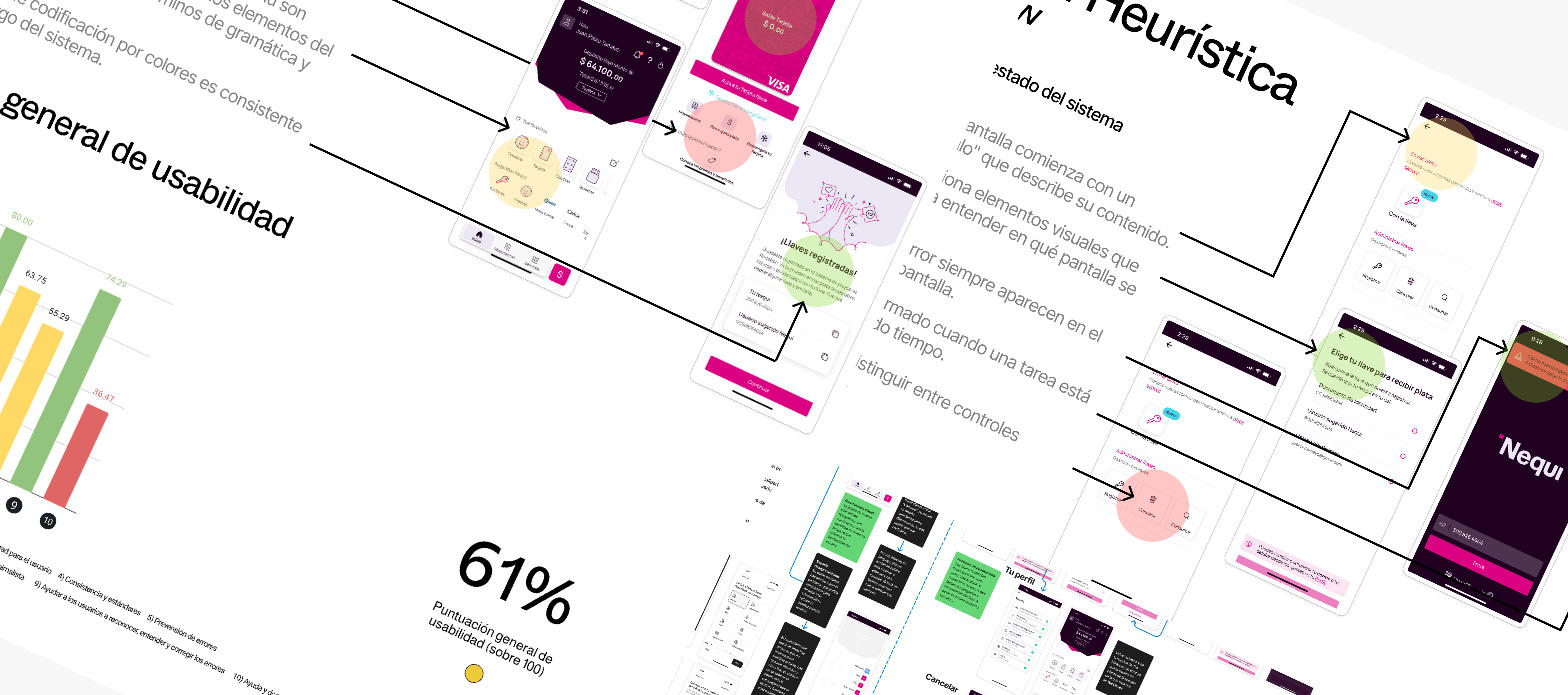
One of the main challenges was designing without direct access to real user data or interviews. This required a deep heuristic evaluation and smart assumptions based on competitor analysis. Another challenge was introducing a new feature within an evolving design system—maintaining visual coherence while suggesting meaningful innovation.
Achievements:
The proposed solution is focused, strategic, and delivers real value to a high-priority user segment. “Mi Tienda” not only reduces friction in key tasks but also expands the commercial potential of the app. It strengthens Nequi’s brand positioning as a supportive, people-first digital product.
Approach:
The process followed a clear, iterative flow: UX diagnosis (heuristics + benchmark), definition of user needs, visual proposal development, and strategic validation. This allowed me to bridge design, business, and technology in a way that’s both grounded and forward-thinking.